WE'VE MOVED!

WAIT, NO. HIDE SOMEWHERE ELSE!

Starting February 2014 this blog will be out of action.

But DO NOT DESPAIR. We've just moved, and you can still find the same riveting and informative posts that you have come to expect on our new blog:
Showing posts with label Watercolors. Show all posts

Tuesday, August 07, 2012

Dragon Watercolor and Final

Color Comp

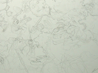
Last time I posted a color comp and a few studies for a recent personal piece.  This is how the watercolor turned out:


 12" x 18" Watercolor on Bristol


As you can see, the watercolor is not nearly as intense as the color comp.  This is something I run into a lot when I do really saturated color comps.  I would like to say that it is a "feature" of my work, rather than a deficiency in my own ability, but I never plan for it.  Somewhere along the way I get taken in by the subtleties and then can't quite bring myself to take it further traditionally.  
Which is where the digital comes in:


Digital work over Watercolor 


The digital allows me to get a lot closer to that initial comp, while at the same time leaving the watercolor alone.  But this, like invading Russia before a winter, leads to its own set of problems. For one, things become more tedious.  In the initial color comp, you are pulled along by the joy of exploration.  There are still mysteries and borders never crossed in the world. But with our comp, we have already been there.  Now we are going back with magnifying lenses and little shovels and rock sampling kits.  It takes a different mindset for exploration. And while I usually love it, it's generally not as exciting as the initial comp for me.

I find that often the only time I ever get excited about a piece again, is after it is printed. Only then can I really judge wether a digitally modified piece has been a success or not.  The digital format can tell awful lies. Sometimes you need to get a piece into the light of physical reality before you can really know. 
Until then, like others whose armies got bogged down in Russia in the dead of winter, I am usually left second-guessing myself and wishing the final was a little closer to the original comp.   

---

In other news: I have been working on Sketchbook 2012.  Preview next week!

Tuesday, January 17, 2012

The Forest Troll Part VII: Watercolor


13" x 21" 
Watercolor and Pencil on Heavyweight Bristol


Next: Digital Trickery

Monday, August 01, 2011

St. George Process Articles on Muddy Colors

Recently, along with a few secret projects that I am not allowed to discuss even under pain of death, I have been working on a small show for Gallery Nucleus.  It is based on St. George and the Dragon and it goes up on August 6th.  

To see some of the methods used in the creation of these pieces, check out the Muddy Colors links below.  


Tuesday, June 14, 2011

Harry Potter Show at Gallery Nucleus

For those of you who keep up with the comings and goings at Hogwart's, the Gallery Nucleus is having a Harry Potter Tribute Show July 9th - August 1. I was asked to contribute a painting to the show, and having thoroughly enjoyed the novels myself (via the fantastic audiobook performance by Jim Dale) I was eager to work on one.
When I started thinking, which scene should I choose? I realized that there were far too many great ones and couldn't make up my mind. In the end I wanted to focus more on a specific character.
I landed on the misanthropic house-elf Kreacher. His story of Master Regulus and the locket is one of my favorite moments in the latter parts of the series.

Drawing on Bristol
Inkwash over pencil
(I did not end up spray-fixing this one, and you can see the pencil has all but vanished.)
"Kreacher"
9x12
Watercolor and Ink on Bristol

Tuesday, March 08, 2011

Illustration Process: Digital Trickery

Original Watercolor

In the last post, I focused on the traditional aspects of my process for watercolor and digital. This week, we focus on the digital hocus pocus used to complete these pieces.

My digital process is mainly derived from the Dutch-Flemish indirect manner of working.  If I travelled back in time and gave the Dutch-Flemish painters an Imac with Adobe Photoshop CS5 on it and a Intuos 4, they might have promptly thrown it all in the lake and then painted an unflattering picture of me as a fruit basket. But then again, they might decide that their methods work well regardless of what medium they are executed in and they would go on to make some awesome work with the new tools.
The process I follow mainly involves first laying in the shadows transparently, and then working in the highlights opaquely on top of them. This is then followed by adjusting the colors and details.

Color Adjustment

I have an ancient Epson flatbed scanner, one that primitive man invented sometime after fire, but before the wheel. Like most stone-age equipment, it is quite reliable, but it does tend to get its colors off just slightly. The image always seems lifeless and dead to me after it has been scanned.
This first stage is just to get the image back to what it looks like to the naked eye in soft light.


Shadows


I work purely in multiply layers to establish the dark areas and shadow details. I work this up to slowly to kind of explore the nuances of the lighting in the image. This chance to explore the lighting is one of my favorite aspects of working digitally.
I use multiply (set to zero black) to add the color. You can use any of the other modes to achieve color, (color, soft light, hard light etc.) I just prefer multiply because it behaves a little more predictably and because it tends to look a little more natural over a traditionally painted image.


Highlights


After working up the shadows to a satisfactory level of darkness, I work highlights in to slowly refine the shapes and give them more dimension. As in the Dutch-Flemish manner, I tend to work opaquely at this point, and generally stick to the areas that are being lit.


Color Adjustments & Final Details

For the final details I work with normal layers to sharpen up details and focal points. I try not to overwork the whole image at this point though. This is both a blessing and a curse with digital. Since you can essentially zoom in forever, you could feasibly spend the rest of your existence refining every little hair. At some point you need to make decisions about what needs to be refined and what can be left a little vague.

Thursday, January 28, 2010

Doomhammer 2010: Watercolor

Man vs. Machine
12 x 18
Acrylic Ink on Bristol


So by watercolor, I actually mean to say Acrylic Ink. I have started using FW Inks for the last few paintings. And if you dilute them, they feel just like watercolor, except that once they are down you can't pry them up. No, not with a thousand golden crow bars. Their only down side that I can discover is that if you apply them straight, with no dilution, they will begin to take on the plastic feel of acrylic after several heavy layers. Other than this I really love them. Perhaps most of all because they preserve the underlaying drawing perfectly.

I am finished with the Acrylic phase, but I am not planning on stopping just yet. I am going to do an experiment:

I am going to do render a digital version of this watercolor, in the same manner as the Hobbit pieces. And then I am also going to take the original watercolor, and after sealing it in a few layers of acrylic polymer, I am going to finish it in oil.
Afterwards I am going to compare the 2 to see which looks superior and post the results here.

I would appreciate hearing your thoughts on these and which you find more attractive. (or less hideous, as the case may be)

Wednesday, December 30, 2009

The Buccaneer

6 x 9
Acrylic Ink on Illustration Board

Monday, September 07, 2009

AWOL Watercolor


Watercolor and Charcoal on Bristol


This week, I've been making zombies; millions of zombies.


I have begun work on an animation project for an upcoming PS3 title and it has consumed my every waking moment. It has been a steady diet of profound carnage, terrifying mayhem and Chic-fil-a chicken sandwiches.

Considering this, you might wonder then how the above image came into being. The truth is that while I enjoy zombie-killing havoc as much as the next guy, there came a point where I had to paint something completely different or I'd lose it.

This was done while waiting for my files to upload to the client. I used charcoal and watercolor this time to try a new approach in my ongoing campaign of finding the perfect illustration medium to work digitally over.

***

Side Note: The PS3 game I mention above is going to be awesome. I wish I could show you the illustration work done on it thus far. However, the lawyers tell me that the company who has hired me will have the legal right to come and toss a pack rabid baboons into my studio if I let anything slip on the blog. Stay tuned.

Wednesday, August 26, 2009

Friday, August 14, 2009

Wednesday, July 01, 2009

IMC 2009: Steam Punk Wizard of Oz

Drawing on Bristol

Underpainting
Note the difference in the two pieces. The composition works much better in the one on the left, and the image begins to make more visual sense. (click on image to see larger version)
This was after the advisement of the faculty who pointed out the dead spot there in the lower left and how knocking back the corner would improve the overall composition.

Final Underpainting

Thursday, June 11, 2009

Friday, February 20, 2009

Wednesday, February 18, 2009

The Battle of Five Armies: Process, Day 3


I don't usually work in this method of object by object execution.  But I am taking a lot of notes from some other artists to try and learn something new on this one. I prefer to work in broader washes of color and tone and then work backwards from larger swaths of paint to smaller. 


Monday, February 16, 2009

Friday, February 13, 2009

The Battle of Five Armies: Process, Day 1

So it begins....


Thursday, January 29, 2009

The Hobbit: Wolf Rider Watercolor Step #3

The final image.
This goblin looks a little too happy to be doing whatever it is he is doing.  I imagine he has either spotted our heroes or that he smells barbecue on the wind.  
Now that I'm finished with it (and it's 3 am here on the East coast) I notice that the wolf seems more dispirited than threatening.  Like he'd just as soon sit this next one out.  I think I will have to get more threatening wolf reference for the next scene. None of your half-hearted, would-be-cocker-spaniel wolves for the Battle of Five Armies.  I need canines of real caliber.  Dogs named "Cerberus" and "Chimera" and "Death-Metal-Jaw-Foot" and the like.  Not "Cupcake" or "Patch"  or "Useless, Whey-Faced Mule" like our sulking friend here.
 
Anyway, so this is a more polished watercolor to compare against the oil painting from last week and the earlier Hobbit pieces. The only digital aspects are pulling up the colors and levels in Photoshop. (Ok and some details in the face. I couldn't help myself.) I had to use my machine at the office for this since my home pc is still in Permanent Sleep Mode.     

Overall I am pleased with the results in this piece even though I am not really sure how I got here. I would really value your feedback. Is there any noticeable improvement on the previous Hobbit pieces?  How does it compare with the Reluctant Dragon oil painting? Should I hang it up altogether and do the Battle of Five Armies as interpretive dance? Let me know what you think.

Wednesday, January 28, 2009

The Hobbit: Wolf Rider Watercolor Step #2

The second sitting and I am losing my mind.  I have no idea how I got here.  The paint dried this way while I wasn't looking.  There are about 10,000 happy accidents here and only about 3 or 4 bits that I actually meant to do.  I'm not sure if that is good or bad really, but we'll take it one more day and see what we get.  

Monday, January 26, 2009

The Hobbit: Wolf-Rider Watercolor Step #1


This is the second study in preparation for the Battle of Five Armies. (I know you are thinking that I am just stalling at this point and that I should be getting on with it about now.  Maybe so, but I really want to get this one right!)

My plan for this Wolf Rider piece is to take the watercolor stage further, past my usual stopping point of colored underpainting that has been the base for the previous Hobbit pieces.  This is the first sitting and what you see here is about my usual stopping point for a transition to digital. Achieving the real deep darks in watercolor without losing control of the piece has always been something of a challenge for me.  
In the next few posts I will be posting my progress with this.  

Side Note:
On the digital front, my pc is still a smoking ruin, and I am still saving my pennies for a glorious 8x core Mac Pro.  (Example Below


Saturday, January 03, 2009